Many things in annoyed me during the 2016 election.
The whole media was even more biased than they usually were in their coverage. Social media created filtered bubbles that caused people to only consume content that agrees with their views and beliefs which destroyed our ability to empathize with each other. And because of all this noise it's been increasingly hard to get simple, unbiased and engaging news. This is why I'm pursuing Clear to solve this.
Hypothesized Problem:
The way we consume news is broken. Social media shows you what you want to see to confirm your bias and keep you clicking.
Background
The traditional journalism model is dying.
You only see posts only from like-minded friends and media. Think about how consuming this information on a daily-bias will impact the way you think. Facebook and Twitter is home to hyper-partisan news and confirmation bias.
The media lies to us to push their agenda. The immediacy of internet has caused media outlets to focus on clicks, views and ads rather than delivering real information. It doesn’t matter if you’re right anymore. It doesn’t matter if you have facts anymore. If you’re a journalist and you report something first, you get the most clicks and views.
It's difficult to fact-check everything. Plus we're satisfied with our version of the truth that agree with our bias. Even when the truth hits us in the face, we dismiss it and present opinions from our personal source of news. Opinions become “facts”. We prefer an entertaining spun version of the truth because that’s easier to consume and share.


Process:
I'll be emphasizing a human-centered design process.
Tools:
Sketch 3, Invision, Pen+Paper, TypeForm, Google, Google Sheets, UserTesting.com
Platform:
A web prototype. Mobile news consumption has risen rapidly and the the biggest driver of news consumption is social media. Almost all users I surveyed said the primary source of news is through Facebook, Twitter, Reddit, etc.
Target Audience:
People who are 18–29 years old who are social media users and keep up with news and politics.
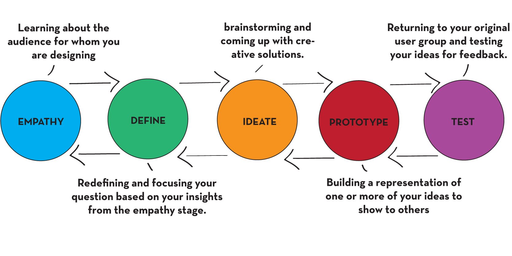
Empathy: Start with users
I started with multiple user personas to better empathize with users and their needs when they consume news.
Click to zoom to get a close up.


Define: Focusing questions based on user insights
After learning about my target users, I focused and defined questions for a user survey to validate my assumptions about problems and how users interact with consuming the news.

Here’s a link to full survey results.
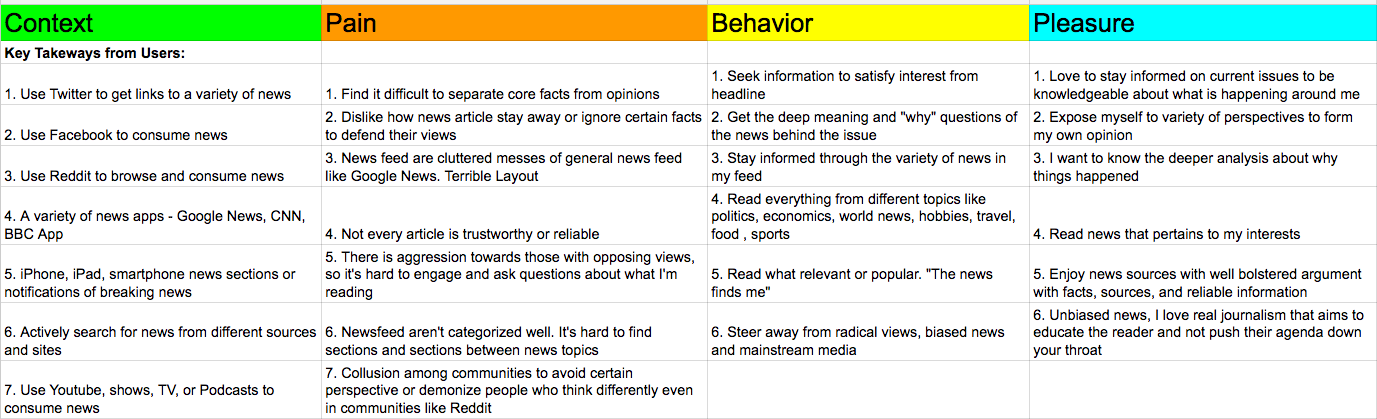
User survey analysis
Here’s what I analyzed and learned from my user surveys. I compiled the main points into a spreadsheet. I organized it among the following:
- Context - how they got to the news
- Pain - what is frustrating about their news experience
- Behavior - how do they typically act and interact with consuming news
- Pleasure - what do they aim to achieve, what are users’ goals and needs

Ideate: Come up with creative solutions after learning about our users
I sketched out some wireframes and had two iterations.
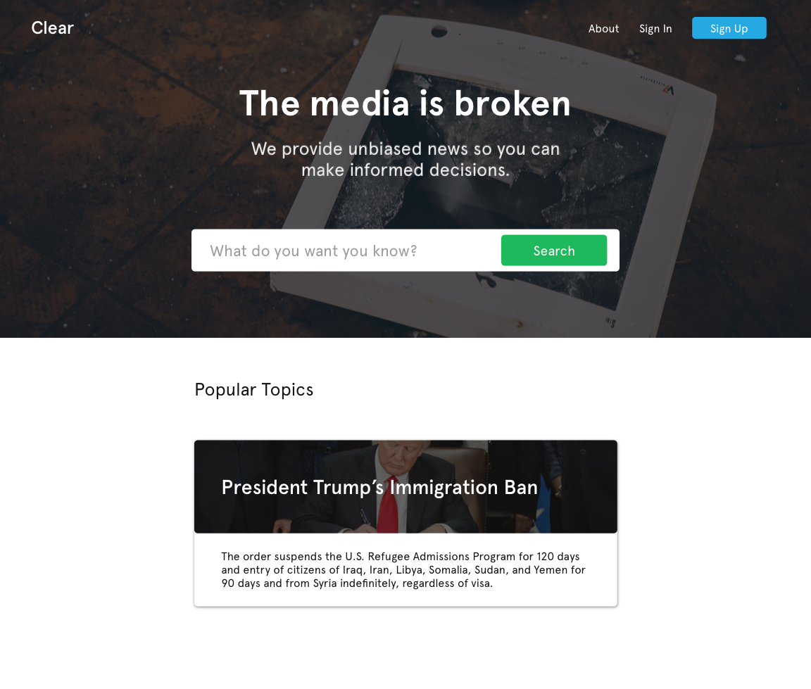
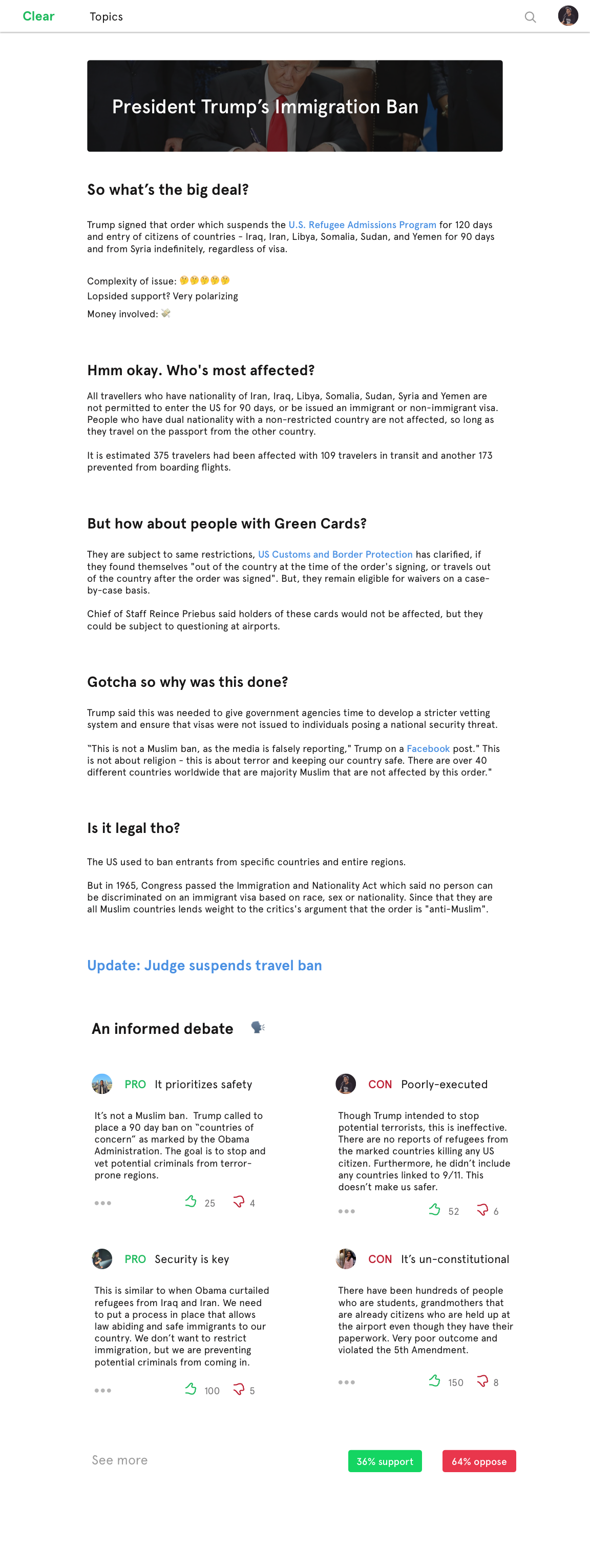
- The first iteration included a search bar for the user as the central call-to-action for information. A lot of news websites have redundant information of the same topic cluttered in separate sections of the site. Likewise you see the similar articles in your social media feed all with different opinions. If you google “Trump refugee ban”, you receive articles from people criticizing the ban, supporting the ban, conflicting opinions, and arguments discussing the legality of the ban. This iteration gives you concise and engaging factual information regarding the ban, so you can form your opinion. Furthermore, there is a debate section to see both sides of the arguments from users who have read the information.
- The second iteration is a “Wikipedia for news” concept. It has the same qualities of the first iteration and you’re able to receive topics; however, users can join the community to collaborate on writing real-time news articles. There are several logistical details that need to be figured out. One is structuring a framework for an trustworthy community of collaborators to create and edit the news in real-time. If Wikipedia can organize the world to create the knowledge library of the world, this can too. Public authors on Wikipedia fixate themselves over the smallest edits and, but they have proven transparency brings not only trust, but also accurate information for the masses. It would be great to have one place on the web where the world can come together to analyze and distribute the news and not just accept the opinions we are presented from mainstream media.


Prototyping
Since my second iteration was more complex, I decided to go with my first design. I produced a high-fidelity mockup on Sketch put them on Invision.
Testing & Feedback
View full results: Click the Prototype Feedback Tab.
Key Findings
- Most users found the content to be effective and unbiased
- The excessive emoji use was detracting to quality of the writing.
- Users wanted to see more sources cited for reliability
- Some users felt though this information was concise and engaging, it could be limiting and simple. They wanted more context around the base of the information.
- Users liked how the debate section offered different viewpoints; however, one said if the issue does not come to a definitive conclusion, it may turn into a partisan debate or like a Facebook comment section
- Users said more social context can be given to the article. It’s great to see the travel ban from the judge update, but how about the ongoing case about legality?
- Using slang could be ineffective towards some users. However, some users loved the use of emojis because it made the article appear visually appealing and fun. They said it targeted the millennial audience well.
- All users understood the mission of this website — to provide simple facts, not biased opinions, on real-time news and topics. I was pleased
- Users would like to see references to the media to directly address how they responded
- Users understood the home screen page and liked the strong call-to-action with the search bar along with popular topics at the bottom, since lots of news websites are cluttered and hard to find the search bar
Next Steps
- I would strengthen the content of the news article and cite specific courses. I would cut the emoji use and consider tradeoffs between making the article seem relatable and millennial friendly while not compromising on quality.
- I would include references from media articles and provide definitive statements on whether popular circulated information is true or false. Definitiveness can boost credibility.
- I would like to go back to the ideation stage and test more designs with users, especially the “Wikipedia for News” idea.
I have a lot of feedback to use. I’d love to get more, break down my findings, go back to ideation and then test more designs. I may even go back to the stage 1 — empathy.
Design success is found when you truly understand yours users. You always have more to learn