As an intern at Connect, one of the many projects I took on was the challenge of designing and developing the landing page before we launched our private beta for our app. You’d imagine it be quite a big project for an intern to take on even working alongside a lead designer! As expected, there were quite a few revisions, but ultimately we ended up shipping an awesome landing page.
Objective
Design and implement a lightweight site to create a sense of anticipation for our upcoming launch and drive users to sign-up via email for our private beta waitlist.
High Level Requirements
- Update the site’s copy to better suggest what’s next coming from Connect
- Create anticipation for our upcoming launch
- Leverage that anticipation to generate a waiting list of users interested in the new app
- Communicate a deeper sense of Connect’s mission and vision
- Provide information and way for potential new hires to apply
Tools and integrations
- Maitre to create a viral waitlist list
- Sketch for design mockups
- Invision to gather feedback from product, design and marketing circles
- Jeets.gs for responsive grid system
- Bower package manager
- Bourbon a lightweight mixin library for SASS
- Lever for job applications
- And can’t forget Google Analytics!
After discussing specs, requirements, user needs and dev with stakeholders, we ready to dive into mockups.
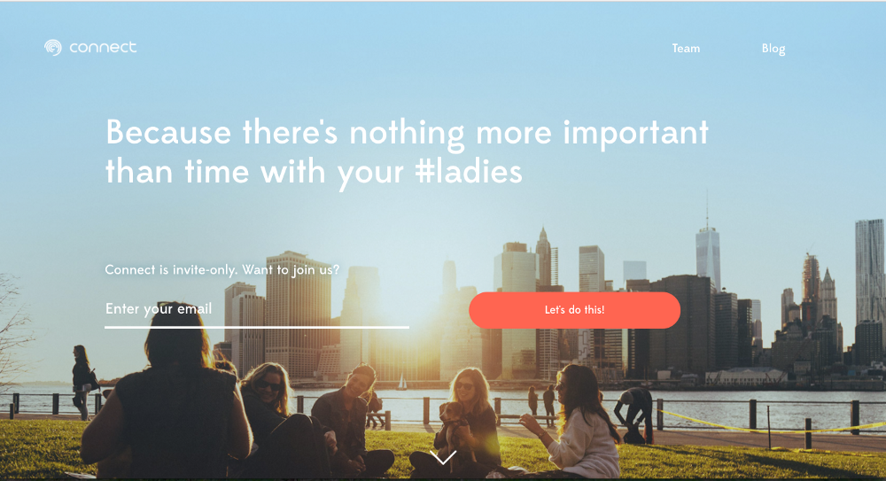
My first iteration
My goal with the first iteration was to set a baseline design that meets the requirements and that we could iterate from. The mockup did the following:
- Strong headline to elicit excitement
- Call to action and user input for entering email to get notified on launch
- Value proposition and problem explanation to give users some context
- Team background image to display fun culture and link to join
- Reinforce call-to-action in the footer
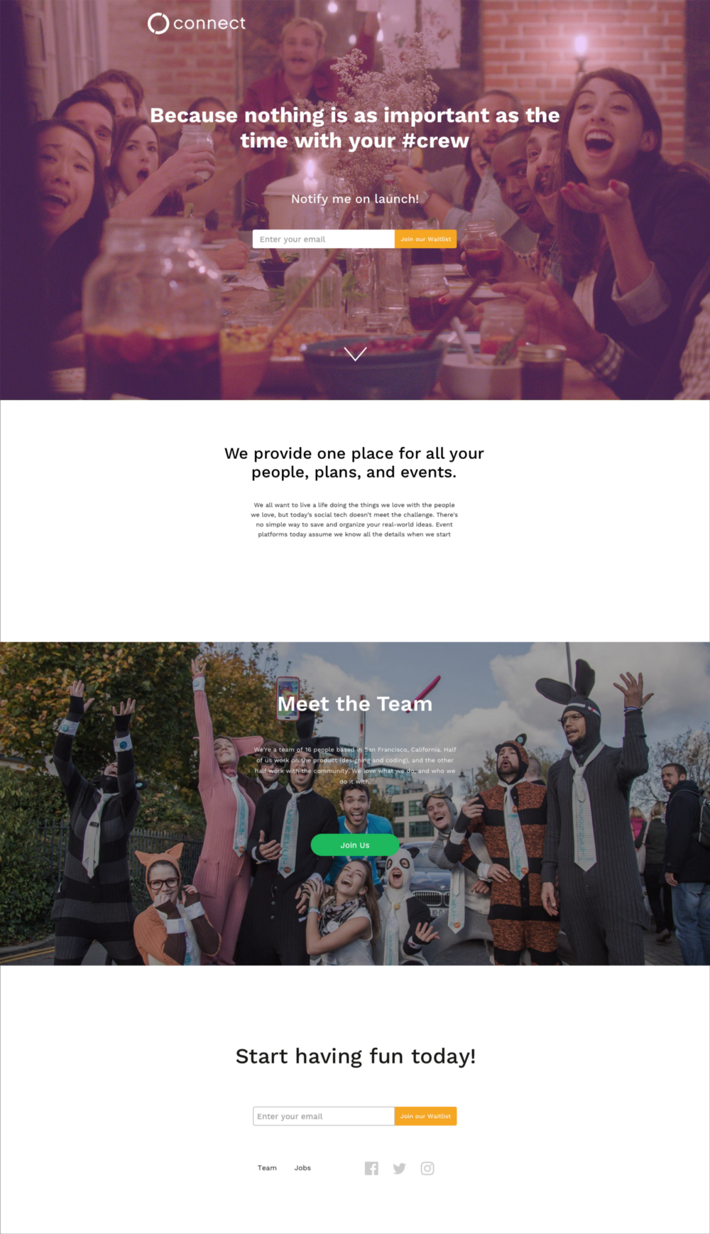
After my first iteration, Matt gave me some constructive criticism on how to improve regarding text alignment, consistency, importance for strong CTA’s, etc. Since we were early-stage, we didn’t have a style guide, so we avoided taking strong stances with colors and branding and just focused on the project requirements and having a friendly tone in the design.
This revision didn’t have text consistency from section to section. What Matt said, is that you want to minimize the amount of different text sizings you have in your html and css since you will be using it in your h1, h2, h3, and p tags.
The text in the second and fourth section also lacked the margin-top consistency from the past section, not to mention the CTA input and button being small and awkwardly sized, which is bad considering that our goal for this website is to drive user signups in our private beta waitlist.
2 iterations later...
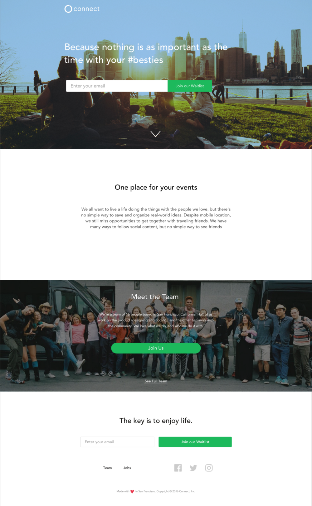
Definitely less clutter and more consistency in terms of elements here. But one thing it lacked was strong visual polish. That’s where Matt came in! Being the amazing visual designer he is, he helped whip up another iteration in no time.
Final Revision
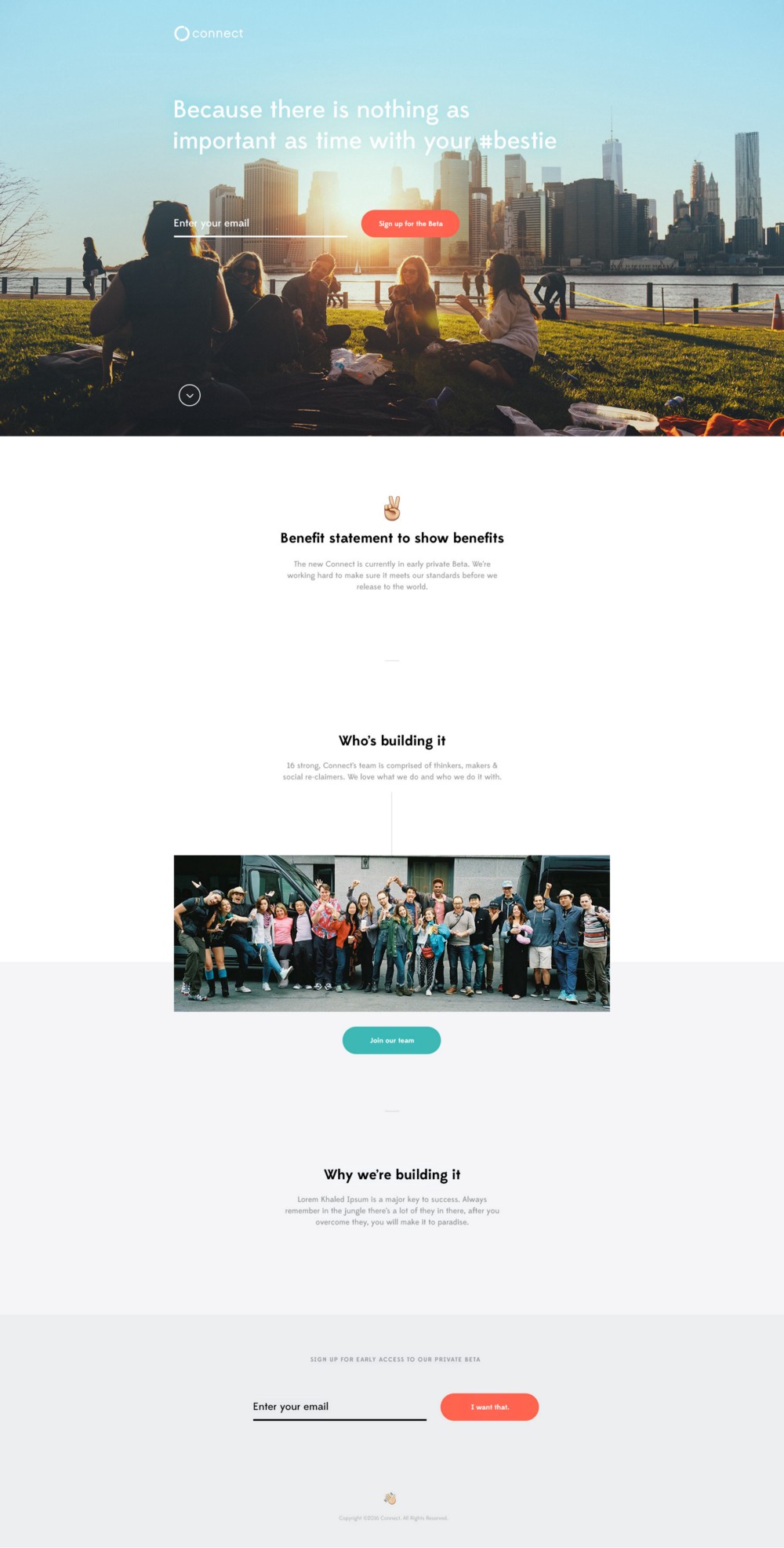
And after this we got to coding, we had a little trouble working with Grunt and setting up our Gruntfile, but we got it!
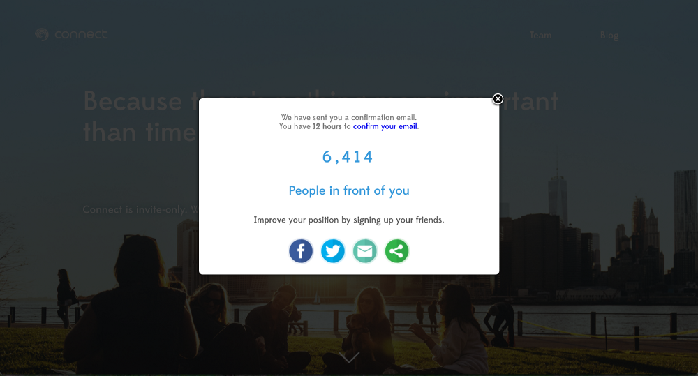
After setting up Maitre, we were able to get a few thousand signups on our waitlist!
Summary
We were able to design and code a landing page in a short time amount of time. That’s what amazing about working at a startup! Moving fast! I learned how important it is to communicate goals with stakeholders, make sure the team is aligned, and preparing tight project briefs to meet guidelines! Not to mention design guidelines, Sketch techniques, using grunt, bower, and sass, a whole ton of other front-end tools!